8 Weeks
Personal / 2021
UX/UI Designer
Brand Identity, UX/UI, Customer Journey
Verdant Yard is a conceptual beer garden, accompanied by its own contact-less mobile ordering app.
In light of the ongoing COVID-19 pandemic, businesses and consumers still resort to contact-less interaction. For taprooms and beer gardens, this means choosing your selection from a virtual menu and proceeding with payment, all on your personal mobile device.
However, unoptimized menu design can lead to extended loading times, excessive scrolling and browsing leading to user fatigue. Here, my users were artsy, cool, impatient grad students, living in the city, likes to order everything on their phones and avoid unnecessary social interaction, but most importantly, they love craft beers.
I conducted competitive analysis to grasp industry standards, secondary research to understand efficient imagery use at different sizes and multiple rounds of unmoderated usability testing to gather user insights, validate my design decisions and synthesize further iterations.
The outcome was a mobile-web app that offered a more pleasant ordering experience. A menu design that was meaningful with information and imagery to keep fatigue low and load times quick. Users felt the menu layout and amount of information presented was “balanced and comfortable.”

The COVID-19 pandemic undoubtedly changed the food industry's relationship with physical menus and in-person ordering. For taprooms and beer gardens, this means choosing your selection from a virtual menu and proceeding with payment, all on your personal mobile device.
The issue is twofold — the process is unoptimized for easy ordering, and there, lacks the personality and charm from interpersonal interaction. Extended loading times, downloading apps, and poor overall design lead to fatigue.
To bring the project to life, I created a fictional persona named Sonia, a cool grad student, to tell the story of her encounter with a beer garden, Verdant Yard, and its constituent digital parts within the ordering experience. As a designer, I have bridged the disparities between intuitive interface and thoughtful, emotive design. Please, enter Sonia’s world and her journey through Verdant Yard.
A visit to a local brewery highlighted pain points in the mobile ordering journey. From browsing menus to entering information, the process was found to be laborious and time-consuming. To improve the customer experience, it is important to identify these pain points and work towards a solution that streamlines the ordering process.
During my competitive analysis, I found one brewery, called Aeronaut Brewing that used the Square platform for their ordering system. While I was going through the primary flow, I discovered many issues that I would like to improve.

A) The images are large and take up a majority of the screen, making it so that you can only see one drink at a time. Also, there are no descriptions or labels regarding the type of beer it is.
There is no way to filter through the menu

B) Selecting a drink bring you to its detail page where you are shown the same large photo and still no meaningful information about the drink itself.
At the bottom, there is a large text field asking for your table number. This would be better served at either the beginning or end of the ordering user flow. Additionally, it's taking up a large amount of screen estate.

C) This brewery has contactless interaction where the staff bring the drink you order to your table. This "How to get it" section address for a store pickup serves no purpose to customers drinking at the brewery. Again, taking up more screen space.
D) The description is at the bottom of the page, below the fold, making it hard to access. This process needs to be repeated if needed to read the description of multiple drinks. This repeated process leads to scrolling and browsing fatigue and working-memory load.
I looked at another brewery as well as a wine bar as an indirect competitor. These were vastly better than Aeronaut's with a clean and easy to browse design.
Trillium, pictured on the left, had a nice balance of information and imagery. There was even a search bar. But the filters were limited to "Draft" and "Non Alcoholic" rather than beer types.
Rebel Rebel, a wine bar, pictured on the right, was also a pleasant experience with an expansive range of filters, simple design and descriptions that expressed information about the drink as well as showing some personality and humor in the language. However, there was a lack of images. A missed opportunity since wine labels can provide valuable information that could be useful to the customer.
Both designs have clean and minimal UI.


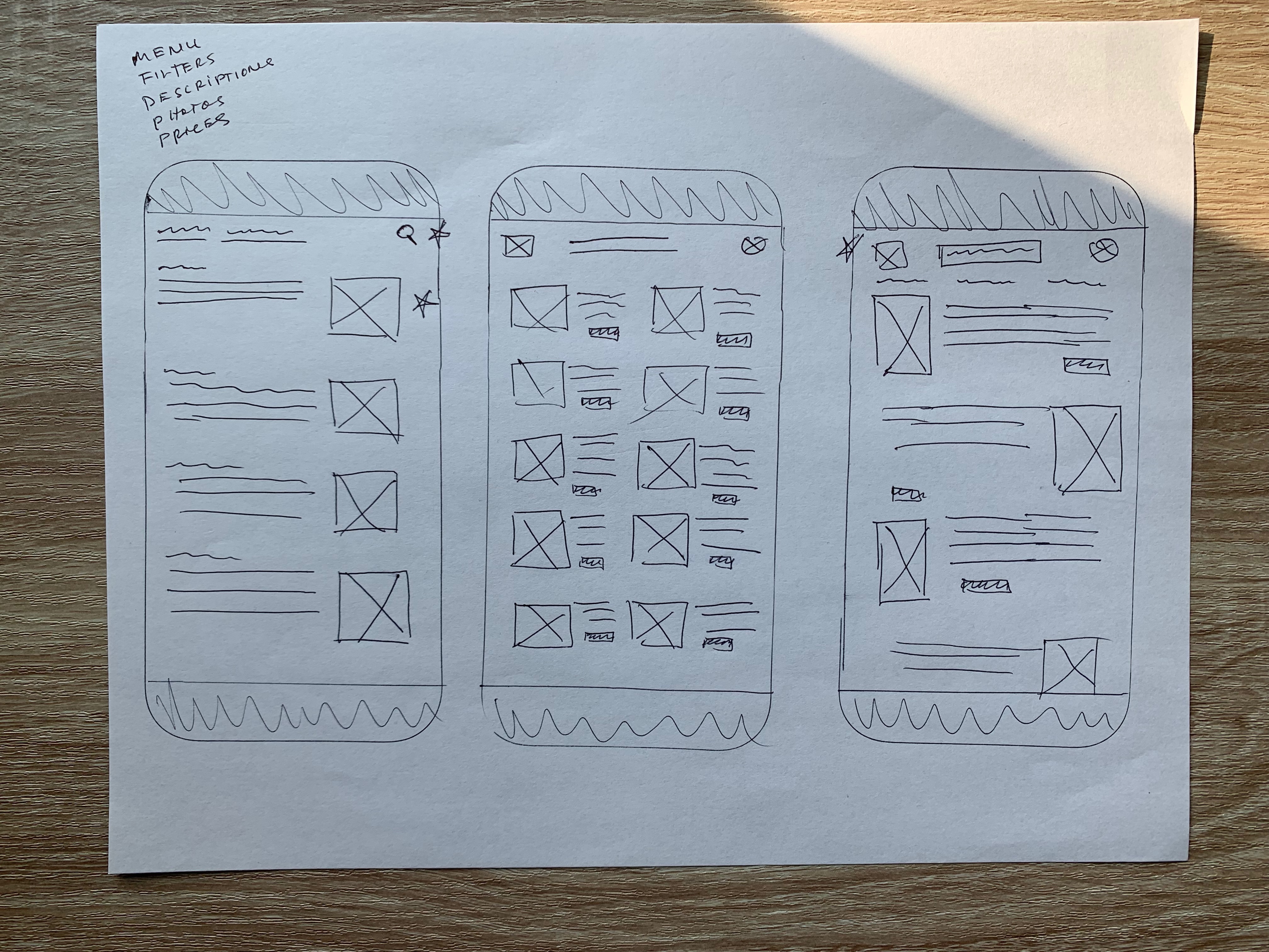
I utilized paper wireframes to swiftly iterate and develop multiple versions of each screen and its components. I marked my preferred variations with stars for further refinement in digital wireframes. Guided by the insights of my heuristic evaluation of competitor designs, I integrated filters, compact images, clear descriptions, and pricing information into my design.
Using Figma, I converted the paper wireframes into digital lo-fi wireframes. I made sure to use conventional blocks to represent text fields, text and image placeholders. I also used the conventional greyscale color scheme and a few instances of simple copy.

Inspired by our persona, Sonia, I selected a color palette of cream, green, and orange to evoke a sense of nature, warmth and an inviting feeling. The typography combines a chic serif font with a modern san-serif style to reinforce the stylish and sophisticated aesthetic.

To gather insights and validate design decisions, I conducted unmoderated usability testings using an initial prototype and a testing platform called Maze. Users were asked to complete a journey — check in, order a drink and check out.

I organized user insights obtained from a round of usability testing. Organzing the insights helped inform the design process and synthesize further iterations from an user-centric perspective.

Overall, users thought the layout was well balanced. There were UI issues such as the filters were not obvious and "didn't seem clickable" as well as a lack of icons during the checkout which could instill a sense of trust and security. I iterated design changes to address those concerns.


The final proposed design for the menu includes cropped images of the drinks, which allows users to see the color and get a sense of what the drink might taste like. These images are smaller in file size, which results in quicker load times and better translation to a small screen. The design also includes descriptions of the drinks, simple filters so users can quickly sort by beer type and the use of typography and color to create a sense of branding.
The checkout include the implementation Apple and Google Pay and in an age of digital transactions provides users a quick, trustworthy payment method. The checkout process for manual payment is kept simple.
Link to the Prototype here
Getting more comfortable in Figma. I can feel my designs becoming more consistent. Before when I was designing, whenever I made changes, I’d have to go back to make the change screen by screen but now with components and a design system, things are much easier and efficient.
Online usability tools. I wasn't able to conduct usability testing with users in-person so I found Maze, a usability testing tool. It was incredibly useful and allowed for a seamless experience for myself and the testers.
First time creating something rather than just redesigning something. It was fun and challenging. I'd love to learn more about branding and visual design. I’ve pondered about the idea of designing for an experience rather designing on the spectrum of good UX and bad UX. While keeping usability in mind, I felt I was able to design for a warm, thoughtful experience while also expressing an aesthetic ethos of the brand identity. I'd love to explore this further in my UX/UI design journey.

