6 weeks
Personal / 2021
UX Designer
Mobile / UX / UI Design, User Research
Driving into a congested city and finding parking is stressful enough, and in a historical city like Boston, the struggle is tenfold. While the development of the ParkBoston app does allow drivers to pay for their meters on their mobile phones, the previous iteration of the ParkBoston felt visually dull and the checkout flow for parking still felt inefficient and slow. The goal was to redesign a parking app that is as efficient as well as minimal and visually coherent. Most users are parking and rushing to get to their final destination, so the app should be intuitive for users under high-stress situations.
User feedback indicated that the flow of the app took too many "clicks" and this issue guided the primary focus of the redesign. Here, my users were Bostonians of all ages, who drove into the city, 1-3 times a week. To test my designs, I performed usability testing with 5 users, in an informal “hallway” style which provided feedback on the final design’s prototype.
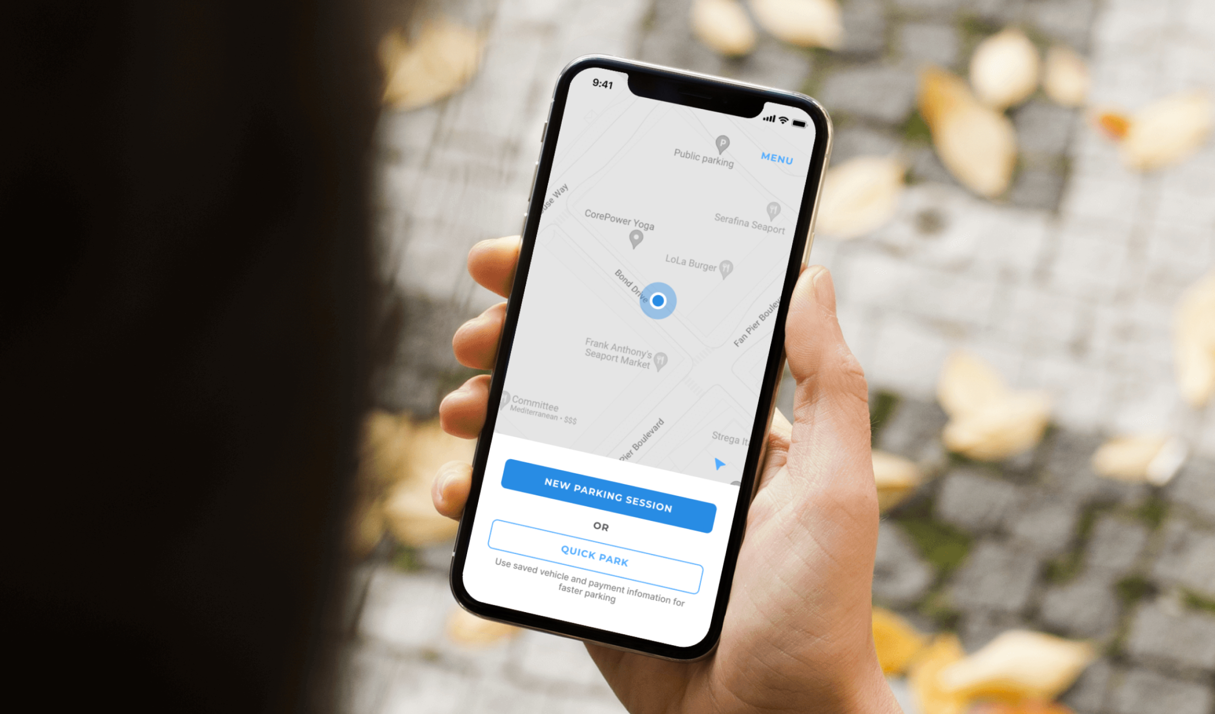
In the re-designed primary flow, I reduced the amount of screens and actions by 50% through the implementation of a “Quick Park” feature — a feature that allowed users to set their vehicle’s license plate and paying method ahead of time. This feature was found to be useful to users as many are drivers that use one car and like to pay with the same card each time. The outcome was an improved task completion rate and user satisfaction.

The current ParkBoston app suffers from several usability issues. User feedback indicated that the flow of the app took too many "clicks" as well as not providing enough security when parking there. Users experienced getting tickets, and expressed the need for a map feature as well as a "Recent Parking History" feature. These issues guided my opportunity to update the app with new design patterns to offer more clarity and efficiency.
Re-design a parking app that is as quick, efficient as well as visually, minimal and easy on the eyes.
UX Design
UI Design
User Research
Initial research was conducted on similar parking apps as well as looking at user feedback from app store reviews to gain empathy for users and understand "what" users need and "why" they need it.
I collected reviews from Apple's App Store for the original ParkBoston app. I selected reviews that had constructive feedback about the app's usability and clarity which would be helpful in recreating a more efficient parking app.

Users mentioned there were too many “clicks”, thus optimization of efficiency became my priority.

I created low fidelity wireframes focusing on an easy and efficient user experience.


To quicken the primary experience and increase conversion, I consolidated the some functionality into one less screen as well as devised a feature to reduce the amount of clicks, called "Quick Park". Similar to how Amazon has their "1-Click Buy".

The focus on the design was functionality and simplicity. The colors and typography were drawn from the City of Boston's website to align with their digital ecosystem.


For the final testing, I chose 5 users who are drivers and have experience parking in the city.
Overall, users appreciated the ease of use and clean design. They also appreciated the map, which made them feel more secure of their designated parking zone (could be something to explore further)
In addition, they enjoyed the "quick park" feature as the majority of the testers primarily drive one car and pay with the same payment method.
Lastly, I suggested users to try the original app again right after using the redesigned app. Most users missed the "Quick Park" feature and immediately felt the lack of efficient screens and gestures of the new app.
I did not use a paper prototype before the low fidelity wireframes which would've provided an extra trial of testing. This resulted in unvalidated assumptions with the email vs mobile account creation. Lastly, I would like to explore other methods of data analysis such as user stories, mapping out user journeys and performing a heuristic review.

